“Mid way through my degree my family relocated to the States, and knowing that I would no longer have a home in Saudi Arabia made me feel quite lost.”
We caught up with Tooba to talk with her about her career:
AW: How long have you been doing graphic design for?AW: Your graphic design has such a bold feel to it. Where do you draw your inspiration from?I’ve been designing for about 7 years. I studied graphic design at OCAD University.
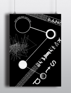
AW: Tell me a bit about your compass work – where each direction is a contradiction.I draw a lot of inspiration from Swiss graphic designers such as Tina Roth Eisenberg and the great Armin Hoffman. I believe the way shapes and text used in Swiss graphic design have an extremely subtle way of making a simple design feel very informed.
AW: The work you did for Swiss Miss really forces the reader to interact with the work, but it’s also quite experimental. What was the inspiration behind this?I designed this during a time my family and I were going through a pretty huge geographical change. I was born and raised in Saudi Arabia and came to Canada for university. Being an expat family in the Middle East meant that we would move at some point but didn’t know when. That year (mid way through my degree) my family relocated to the States, and knowing that I would no longer have a home in Saudi Arabia made me feel quite lost, as that was the only place I knew as mine. So when I designed this a lot had been going through my mind about where I’d call ‘home,’ and attached were frustrations of trying to figure that out. The metaphor of the compass was used to further illustrate that even with something that tells you directions, I was still lost.
This was part of a project where I had to pick an audio/radio interview and try to create a story out of the spoken words using just the words and experimenting with the typography alone. I drew inspiration from David Carson; his work is extremely playful in nature and really defies all rules of design. So while I was creating it, I focused a lot on the emotional quality of each of the words, then I presented them in a typographical orientation I believed best represented it. Whether it was an exclamation, sadness or joy when you look through the pages there are peaks and valleys amongst the words that allude to the emotion being expressed by the interviewee.
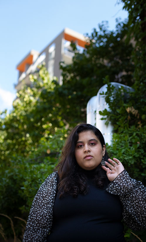
AW: What was one of the most exciting projects that you have worked on?Tooba Syed, Toronto. Photo. J. Perrella.
A pivotal project I worked on was my thesis called Broken News. It’s a project that is still very close to me. It was an exploration of Islamophobia in Canada and the various ways censorship can manifest itself in one’s everyday thinking and expression. I think this project is important to my practice because I pushed and challenged my thinking in many ways. More specifically it allowed me to critically assess the decisions I make as a designer. I learnt how important it is to create with intention. To ask myself what the viewer will take from it from a glance, will they understand what I attempted to do without having to read all my research? What makes a project successful in its delivery? How can I design a visual experience that tells the story that I want to communicate in a clear and cohesive manner? More than style, this project allowed me to understand that a designer’s job is to create a seamless experience for the viewer, but at the same time to know that may need reiterating my ideas and concepts hundreds of times. My style therefore has developed into creating intentional design; where aesthetics are important but not more than the function of the piece.
AW: For many of us, our routines/things that we’ve grown accustomed to for “recharging our creativity” have been disrupted. Some need social interaction to help spur ideas, while others seem to be managing quite well (some really incredible and unique work has bubbled up from isolation). Do you find these recent few months have impacted your creative process?I think one of the most exciting projects I worked on was ‘Mutual’ magazine. It was exciting for many reasons but primarily that I got the opportunity to design, photograph and art direct all the content in it. Being a photographer and designer making a magazine is one the most rewarding things to make. It was a concept I came up with in order to create a space for people with backgrounds of more than one country and discussing all things identity and culture. In making this I wanted this to be for everyone because almost everyone has an experience to share and therefore the name ‘Mutual’.
AW: Every creative has to self promote now and then (now more than ever it seems). What do you do to keep yourself out there?Definitely, I think this time has allowed me to hone in on my skills, but also to stop for a moment and try to understand that the process of creating is as important as the final. I have been forcing myself to go out more with myself and to sit and reflect on the things I’m working on professionally and personally. Another thing that I’m trying to constantly remind myself of is to take my time in making and that some projects need that extra time.
See more of Tooba’s work at Tooba-Syed.I have two instagram accounts where I post my ongoing work. One is for my photography @tasveer_ts and my other is a space I’ve created for myself to make and share anything design related. I’m experimenting with @2bamakes.
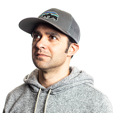
Filmmaker with Angry Whale Media.


